
Branding a rallying call to drive climate action in the Bay Area
Timeline
Jan - May 2023
Tools
Figma, Illustrator
Role
Visual Designer

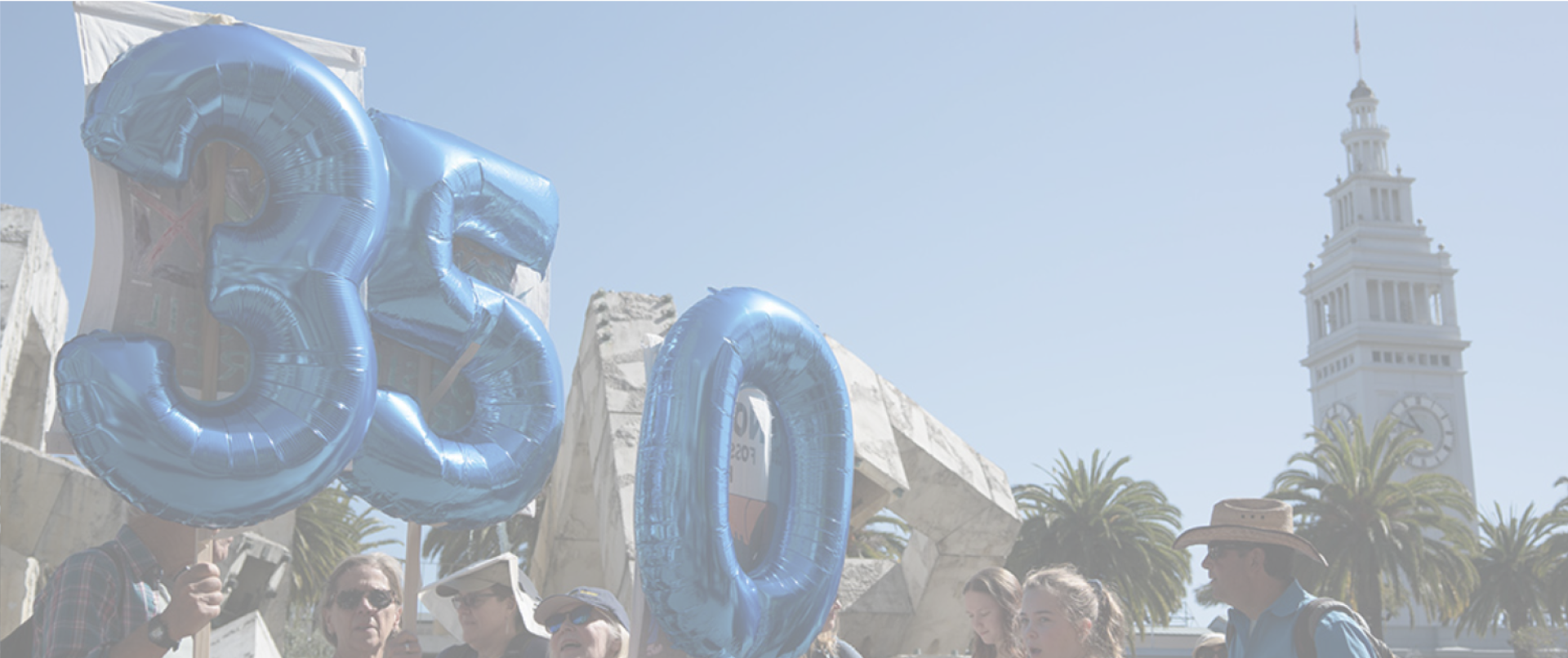
About 350 Bay Area
350 Bay Area, a grassroots climate advocacy organization in the SF Bay Area, is committed to achieving a clean energy future with a focus on racial, economic, and environmental justice.
To support this mission, a rebrand of their marketing materials and social media campaigns was developed, with the goal of engaging younger populations and driving civic action. The result was Climate Canary, a 25-page brand book that defines the organization’s story, visual identity, and usage guidelines to ensure consistent and impactful branding across all platforms.
How might we reimagine 350 Bay Area’s brand identity to create a rallying call to combat the climate crisis and grow 350 Bay Area’s youth activist demographic?
Understanding engagement levels
We conducted a brand audit on past survey research and social media analytics, and found that:
350 Bay Area’s Facebook following is evenly distributed amongst the 35-65+ age range, whereas their Instagram following congregates at the 25-44 age range, suggesting a generally younger target audience.
On both platforms, the gender demographic is at least 60% women-identifying. Furthermore, 350 Bay Area website visitors are majority new users who don’t stay on the site for long — browsing for <30 seconds with most referrals coming from other local sites/institutions.
Volunteers value 350 Bay Area’s emphasis on individual, remote action, and group, community protests that have local impact.
We pushed out two surveys: 1) an engagement survey where we reached out to current volunteers within 350 Bay Area, and 2) a 18-30 Demographic Survey.
In the engagement survey, we found that: the current volunteers are actively involved in climate activism outside of the organization but the community lacks diversity in age and race. Both factors combine to create a strong barrier of entry for interested younger volunteers.


We found that: those in the 18-30 category are not confident in government action to address climate change.
Despite being involved in climate activism through digital and individual actions, individuals ranked their level of climate engagement on the lower end of the spectrum, and are either neutral or unsatisfied with their engagement level.


Based on the demographic survey, we interviewed participants to identify what inspires 18-30s to engage in climate activism and what makes an efficient climate movement brand through an activity where we asked them to give first impressions of 350 Bay Area’s website and Instagram.
Some interesting things we extracted from this data was that young people are often immobilized by their form of transport, lack of motivation if they feel their actions won’t make an actual impact, there is a discrepancy between content across social media platforms and there needs to be an emphasis on diversity.
Our brand and messaging needs to be accessible, bold, empowering to emphasize providing individuals with a space and platform within the climate movement to take tangible action.


We created a brand positioning matrix to identify where we want our brand to fit into the overarching system.
We noticed that there were more brands that have color palettes of blue and green, which we wanted to differentiate from. We also realized that most brands lean towards being exclusively ‘hopeful,’ towards the right half of the matrix, and we wanted to differentiate from that too by creating a more urgent branding. We also wanted to highlight 350 Bay Area’s focus on the community.

Next we conducted a competitive and comparative analysis by examining six different environmental movements and nonprofits. We realized that we needed to find a middle ground between extreme, high barrier of entry, considering movements that took an incredibly dire approach (extreme action and protest like Extinction Rebellion) and hopeful, soft-spoken, fun organizations that emphasized community service, speaking up, and progress (like Save the Bay).
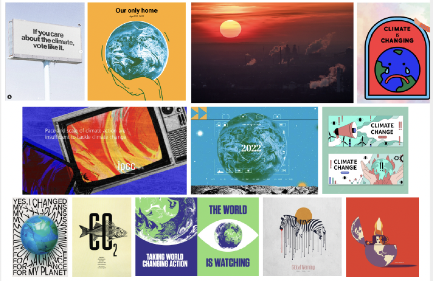
Reimagining the brand
In the initial ideation process, we curated mood boards to reimagine what 350’s social media feed could look like after a rebrand. A lot of it was finding a balance between dire imagery that calls for action and soft imagery that inspires hope. We decided we wanted to incorporate both moods.
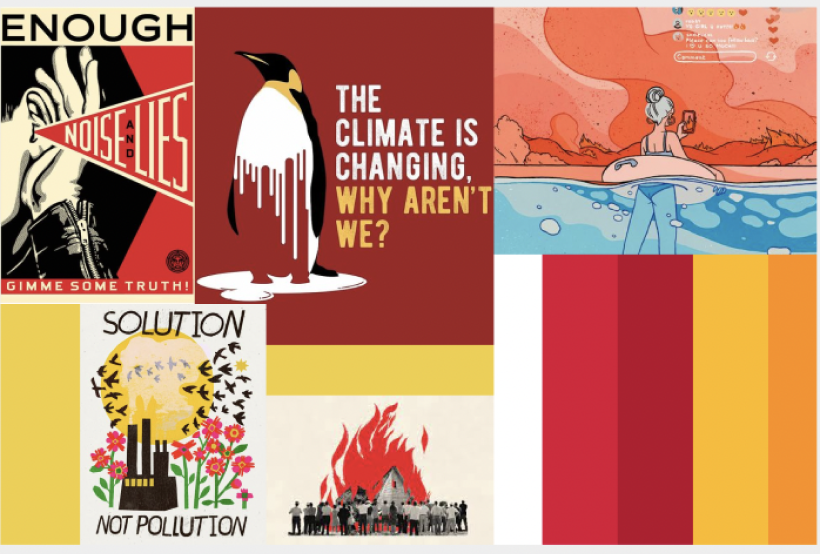


The color palette uses bold red and yellow to stand out and emphasize crisis, while green and blue serve as secondary colors to reflect environmental values and inspire optimism. Altogether, the design creates a brand that is emotionally resonant, visually distinct, and mission-driven.

“It’s time we listen to our canary – our planet – that danger is present.
Now’s our chance to be heard.
Don’t miss the signal.”
The visual identity of Climate Canary is built to balance urgency with hope, and activism with approachability. The bold “C” in the name stands for both the brand and the climate focus, supported by a modern sans-serif typography that avoids corporate stiffness.
Headings are set in bold all caps to project urgency, while softer, rounded fonts in subheadings keep the tone human and accessible. The canary mascot adds a sense of community and identity, with an angry eye that injects urgency into its otherwise friendly design.
Shading, inspired by coal mine smudges, adds depth and reinforces the metaphor of the canary as a warning signal. A subtle headlight element symbolizes the brand’s mission to illuminate hidden threats, much like canaries did in coal mines.


Frequency and consistency is the formula
It is not enough to launch one campaign - it takes consistency to achieve a wider reach. Aside from consistency, any form of visual communication should have a recognizable, refined style to leave a lasting impression on the audience. Frequency and consistency is the formula for content creation and brand advocacy.
Reflection & Takeaways
Copywriting is a storytelling craft
Creating succinct content that aligned with the brand tone while standing out from the crowd posed as a challenge. The team went through multiple revisions of the names, mission and rallying call statements before arriving at a 25-page brand guideline. As college students, we sympathized with the problem space as we recognized the conflict between desire for action and actual pursuit. Having talked to the existing volunteer base and those in the 18-30 demographic, we saw opportunities to bring storytelling and clarity to the texts and visuals. The package of an urgent call for action requires simplicity.
Next StorySecondhand shopping experience for sustainable fashion
Researched and prototyped three new social features on thredUP’s mobile app to improve the secondhand shopping experience.
Read →